
SIMPLIFYING THE MOBILE EXPERIENCE
Reducing and improving the workflow of uShip’s flagship mobile product, to increase usefulness.
UX Audit, Information Architecture, Workflows, Concepts, Prototypes.
BEFORE
The original application was very poorly organized. Important pages were hard to find, and needed multiple clicks to get to the correct screen
Legacy Search: The legacy search was bulky and tedious to use. Too many interactions were needed to complete a most basic search
AFTER
The redesigned flow got rid of redundant pages and interactions, and made the application much more manageable and easier to use
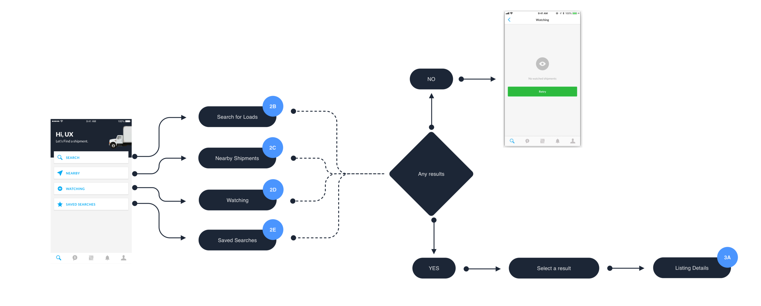
New Search Flow: The new search is simpler and has less screens and interactions. Based on user research, I removed any and all unnecessary features and interactions, and redesigned the flow to match user expectations.
The Challenge
uShips mobile application was out of date and needed some minor upgrades while the product was being migrated to the cloud
The application was not following industry best practices for interactions or information architecture. As a result, basic tasks were hard to complete.
Too many unused features were cluttering up the product.
Some features were incorrectly prioritized. This meant useful features were hidden and hard to access.
With a fixed launch date and limited resources, the redesign needed to be done in less than two weeks
My Role
Analyzed and mapped out the products workflow in order to highlight unnecessary interactions
Applied industry best practices and updated the information architecture to make the application more usable and useful
Facilitated design workshops to help accelerate redesigning some of the features
The Process
Mapping out the entire application
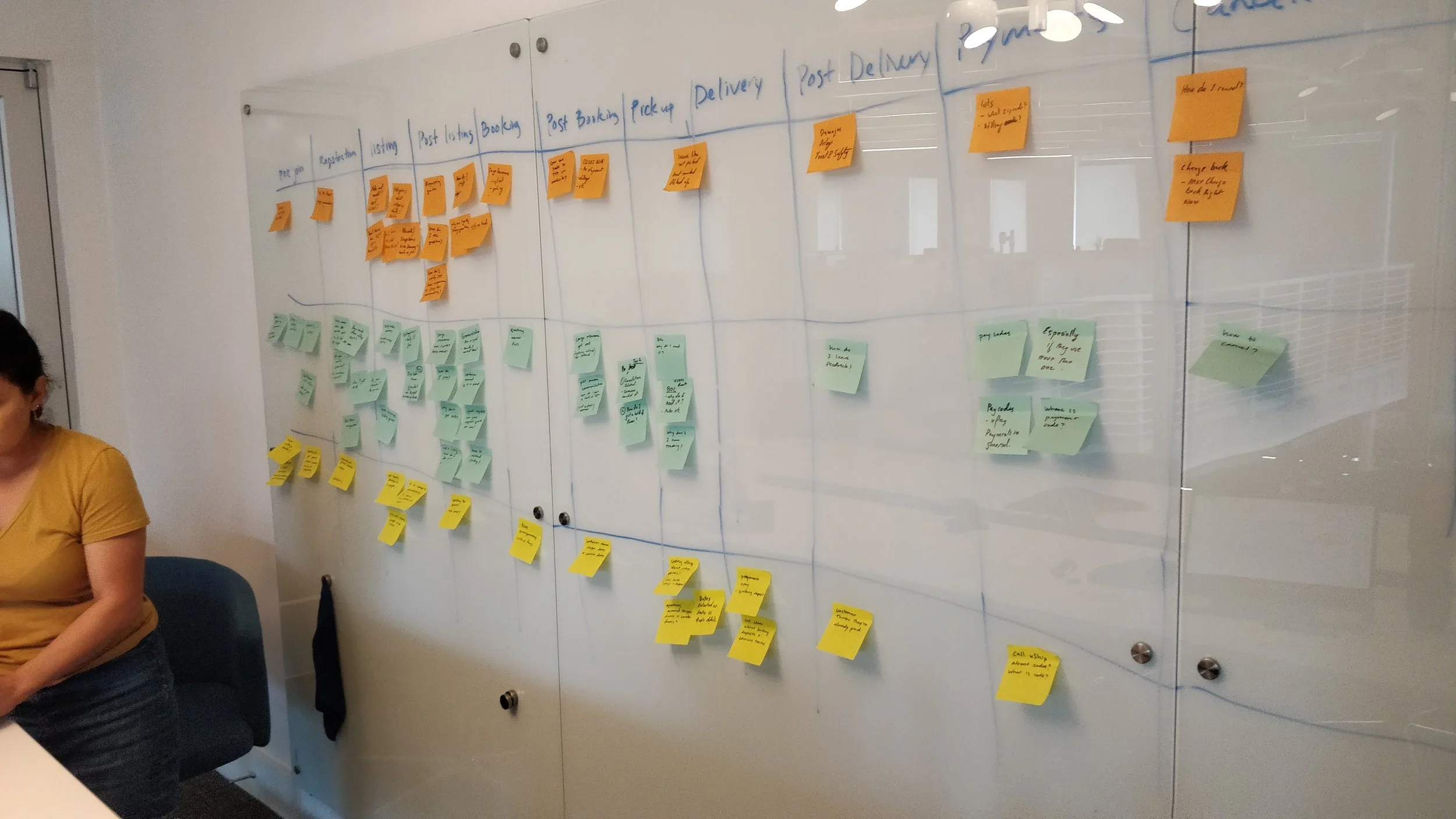
The original goal of the project was to simply migrate the application to a cloud based service, and not make any large changes to the product. The help the developers get a better sense of how long the migration effort would take, I mapped out the entire application to bring visibility to all the features and complex interactions.


Understanding how users interact with the mobile application
When I joined the project, there was very little understanding on what the users needed, simply because it can be very difficult to get a hold of them. Transporters (primary users) are always on the go, delivering between states. They may not have the time to give us detailed feedback on what works, and what does not.
To shed some light on user behavior I decided to consult our customer service team to see what kind of questions they typically answer, as well as analyze website traffic to understand which features are being used the most, and which ones are being ignored.
Customer Support interview: Interviewing a member of customer support to figure out the most common customer complaints

Analyzing mobile traffic: Analyzing mobile traffic to figure out how users are interacting with different features
Improving the workflow to remove redundancies
Mapping out the entire product made it obvious that it was bulky, hard to navigate, and inefficient. There were too many unnecessary steps and interactions were not following best practices. As a result the application was difficult to use, and the developers estimated that it would take about 312 hours for work to migrate the application.
We looked at this as an opportunity to reduce and remove some of the unnecessary interactions, and streamline the flow. Since we were on a very tight timeline, we had to come up with our recommendations as quickly as possible. In order to do that, I conducted a design workshop and helped map out all the improvements we could make in less than a week..
Choosing the most impactful fixes (Navigation & Search)
Given the limited scope and time of the project, we wanted to fix issues that would impact the usefulness of the product the most. Based on our research (quantitative, and qualitative) we decided that navigation and search needed major changes to dramatically improve the overall experience.
Opportunity Map: Helping the team prioritize which features to build first.
Design Sprint & Iterations
Since time was our biggest constraint, I planned and conducted a design sprint to get the team on the same page about some of the solutions. The output of this step was high level wireframes that helped the developers estimate solution feasibility.


Iterations: Quickly mocking up some wireframes to explore the feasibility of different interactions
Key Insights
Here are some of the major insights about how our users want to engage with the mobile application
Users start with a broad search and then narrow down

Most of our carriers start by running a very broad search (Looking for vehicles to haul in Texas).
When they don’t find a good match, they start to narrow down their search by being specific (Sedans that need shipped from Austin to San Antonio).
Finally, they may use a couple filters to find the ideal shipment
Most users only change 1-2 filters

Location filters were the most commonly changed. Everything else was set once and left alone. After all, a car hauler only hauls cars, and has no interest in hauling animals.
Design Solutions
Making search the focus of the application
The original design focused on showing results first, followed by asking the user what they were looking for. About 98% of our users never actually looked at any of the default results. They would almost immediately start to filter the results.
The new designs focus on search first. We straight away ask the user what they are looking for, and based on their search criteria we show them the appropriate results
Legacy Landing Page: The legacy landing page focused on quick links to features that were not being used,
New Landing Page: The new landing page focuses on search since it’s what the users are primarily going to do. (Design in collaboration with Jessica VanNess)
Search is easier and matches user expectations
Search - Our users start with a broad search, and if they can’t find a good match, they user filters to narrow down.
Filters - The old designs hid the filters behind a few screens. This meant that users were unable to tell what filters are currently applied, and had to go through a flow to change any one individual filter.
The newer designs allow a user to see the results and quickly make changes to the filters. This reduces unnecessary steps and interactions.
Legacy Flow: It took 7 pages and 9 clicks just to search for a shipment. The focus of the application was not on searching.
New Search Flow: The new designs make it significantly easier to search and filter results
The Final Designs
I worked closely with visual design, product, and developers to make sure the designs were implemented as intended.
Final Designs: The new flow is more streamlined, and easier to use. Design in collaboration with Jessica VanNess
Results
A simpler more streamlined application
The developers originally estimated that the migration was supposed to take upwards of 300 hours. Because of workflow, IA, and design improvements, the new designs took less than 120 hours to build!
Increase in listing interactions
The new search also showed an increased engagement with listings. Previously on average a carrier would interact with 4-8 listings. The newer designs increased this to 10-15 on average.